
I have not really given much
thought to the design of ancient manuscripts and texts. After looking through several digital
versions of the beautiful works of art, I chose to review the Book of Kells, a manuscript of
the Gospel, which is intricately illustrated with Celtic motifs and deep
symbolism. For the purpose of this
project I have viewed and noted several instances of how even in ancient
civilizations the writers and artists of the time often used the CRAP
Principles of Graphic Design. The
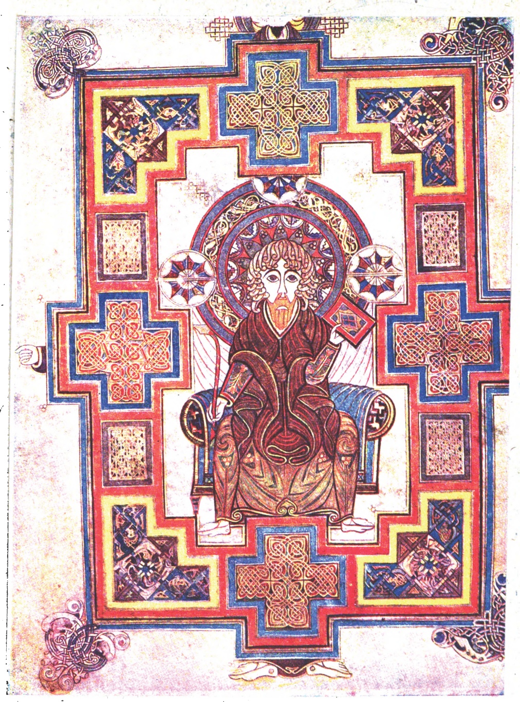
specific plate that I reviewed is, Plate XVIII. Portrait of St. John. FOL. 291
V.
For contrast,
the designer used color and took advantage of “white space” to give the colored
images highlight. The frame of the image of St. John is symmetrical and several
motifs are repeated. This is an
illustration of how the designer used repetition. All images and motifs are aligned. The celtic motif at each corner is aligned with the “hand”
on the left side at the center. I
can assume that since the design is symmetrical, the right is aligned in the
same manner. The image of St. John
is centered in the frame. This proximity says that this is an image to be
considered important.
The artistry of
these images and illustrations are wonderful. So much care was taken to make ever detail important. It is no wonder that people often turn
to these designs when creating body art.

No comments:
Post a Comment